We were fully briefed at the beginning of 2nd year.
The brief consisted of a brand evaluation on a chosen contemporary brand.
Creating a trend book (for designers) inspired by our summer research and relevant WGSN information.
We were then to design from our trend book for our chosen brand and produce a final collection of six outfits (including 6 tailored or denim pieces.)
6 stylised fashion illustrations were to be produced to illustrate each outfit, technical flats of garments to accompany the illustrations.
Finally we were to give a presentation to the 'head of design' at our chosen brand using PowerPoint, informing them about our trend and collection and why it should go in store.
I chose French Connection to produce my Brand Evaluation on and produced a very thorough evaluation including:
Brand History, Customer Profile, Shop layout, Trends and colours, Key silhouettes and fabrics, Pricing and labelling and finally, Marketing and Advertisement. This helped enormously when designing for their brand as I achieved a huge amount of knowledge and understanding of their brand.
I am very proud of my trend book and the majority of imagery used was my own; this stemmed from the thorough research I produced. The majority of my trend book was hand crafted and overall it looked professional, however I would like to improve the quality of professionalism in future projects (further use of CAD.)
Designing from my trend book came easier than I predicted, After producing my trend book I had a clear vision of the collection I wanted to produce. I do find designing quite taxing, as its easy to loose focus and go off on a tangent. However producing a 'collection action plan' beforehand was most helpful.
I was daunted at the idea of producing 6 fashion illustrations, as drawing is not a strong area of mine. However I researched into this and adopted a child-like style (Rodarte) to reinforce my trend. I am pleased with my illustrations and the way in which they are presented simplistically. Improvements on the rendering of my fabrics is something I should be working on in future modules.
Finally, my presentation went smoothly, i was nervous beforehand but had a clear vision of my trend and confidence in my collection. I merely shared this information with my audience and answered any criticisms I thought they would have (for example the light cotton fabrics for winter use were justified with the use of layering.)
Wednesday 29 December 2010


Applied Fashion Design- Summer Task
During the summer 2010, we were set a pre-module task to be completed during summer and before the beginning of 2nd year.
The tasks consisted of: 6 or more A3 research pages on a chosen word and including 'cool hunting.' A fabric swatch file with swatches relevant to my research, detailing fabric suppliers and prices and details of all swatches. The final task was to illustrate a dynamic 'cool hunting' image taken from the research in 3 different styles.
I chose the word 'Modern-rural' and thoroughly enjoyed the research stage. Because I had the summer and the luxury of time to complete my research I was able to collate ample imagery and sift through to pick which was relevant. I explored farmyard living and scenery, the modern farmers wife, afternoon tea and today's brands which are inspired by these; mainly Cath Kidston and Jack Wills.
I am very proud of my research and produced 9 pages, I have struggled with research in the past, however I steered the term 'Modern rural' to incorporate a theme I am very passionate about (the world of cake baking and afternoon tea!)
I found the 'cool hunting' a struggle, as it is extremely time consuming looking for people dressed in a certain trend and not always possible to take their picture. However I used my initiative and styled a friend using the new autumn/winter stock available.
Wednesday 26 May 2010
Sum-up of being a 3rd year's design assistant!
I really enjoyed working with my 3rd year and feel I have picked up some useful techniques from her with regards to time management, presentation and page layout skills. Most importantly I realise it's essential to focus on a concept you are strongly passionate about and the amount of work will not be noticed as much!
3rd year's design assistant - 19th May
Completed Tasks...
AM: I went into Leeds city centre with a big shopping list my 3rd year had produced for me, I managed to source everything and in the budget she gave me!
Shopping list included:
- Straws - Silver, black or gold (for her model shop.)
- Metallic Silver paper (for her model shop.)
- Small brown card gift box with lid (for her event invitations.)
- Transfer printer paper (for transferring her logo onto fabrics.)
- Notice board pins.
- 3 metres of thin black ribbon
PM: I cut down the black straws to make 'curtain poles' for her model shop. I threaded them through the jersey 'curtains' she had made and fitted them into the 'fitting rooms' of the model shop. I then cut down the metallic paper to make a 'mirror' for each 'fitting room' in the model shop.
What I had learnt: Admiring her shop I realised just how much time and effort it must have taken to plan and produce such a detailed model shop.
3rd year's design assistant - 12th May
 Alexander Wang and Sonia Rykiel also created urban/sports inspired garments.
Completed Tasks...
AM: I sourced Internet images relating to her collection (urban/sporty) for my 3rd years mood boards. She was to design extra items (underwear and accessories) to accompany her collection within her shop.
PM: Prepared brown paper A4 sheets to print my 3rd year's final swing tags on. Produced variations of swing ties; plaited string, loops, slip-knot etc. Together we decided on the plait as this looked the best and corresponded with her other bags and boxes she had made.
What I had learnt: It is essential to try out variations, otherwise you have not experimented and there may be a more suitable option than the one you first decided on.
3rd year design assistant - 5th May
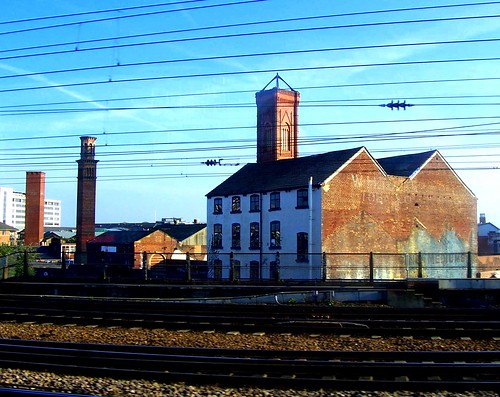 Tower Works. The wall on the right provided the run-down urban look my 3rd year wanted to reflect her collection.
Completed Tasks...
AM: I pressed all garments and trimmed all threads in preparation for the photo shoot. My 3rd year had an idea of the location for her photo shoot, we researched the location together on the Internet and decided it was a place called Tower Works, Holbeck near Leeds train station.
PM: Founded the photo shoot location and transported all the garments and props (lace masks and shoes) down.
The photo shoot took place and I had an input with ideas and possible poses to reflect her collection.
What I had learnt: How to improvise- to achieve the best possible photos (dynamic poses against a powerful background) without damaging the garments.
3rd year's design assistant - 28th April
Tasks completed...
AM: I went into Leeds city centre to purchase more thin black ribbon (Samual Taylors) for garment hanging loops and a thicker version for the 'hidden identity' themed face masks. I also purchased 6 wooden coat hangers and 4 long clear coat covers from Wilkinson's, for her garments.
PM: I hand-sewed one of the lace face masks together ready for the photo shoot. I then pressed her garments and hung them in the coat covers for safe-keeping.
3rd year's design assistant - 21st April
 Impressive use of drawings and visuals!
Tasks completed...
AM: My 3rd year introduced me to her concept (hiding a person's identity within an urban habitat) and showed me her final line-up. I thought this was a very thoughtful way to begin, as I then had a background knowledge of her work and could relate all tasks back to this.
I scanned all her research and design development pages into photo shop in order to place her collection logo down the side and achieve a professional finish (no texture/bulk) on every page.
PM: I went into Leeds city centre to source black lace and 2 metres of thin black ribbon. The black lace was difficult to find and I bought an inexpensive one from Leeds market. I think I should have checked with my 3rd year before buying as she hadn't been very specific but luckily it was only needed for sampling! Thin black ribbon was easy to source at Samual Taylors, 42p p/m.
What I had learnt: It was very beneficial to see her research and design pages as I often struggle with these. I took a note of her page layouts and what she had included in her annotation. They made a good visual impact.
Becoming a 3rd year's design assistant
I was quite nervous about this task as well as excited to gain an insight into the final year and get an idea of what to expect.
I was teamed with a 3rd year on Pathway A, the more innovative and advertisement based pathway. As I had lent towards Pathway B for the majority of the year, I knew this would be a valuable experience to learn about the 'other' pathway and possibly clarify which would be best for me.
We worked along-side our 3rd year every Wednesday for 5 weeks during their final stages of their Final Major Project, I kept a dairy of tasks that I was set and how I spent my days....
Tuesday 25 May 2010
Interdisciplinary Images...
 My craft package. The swing tag doubles up as a boho headband once the tag is removed.
 My finished maxi skirt, inspired by ivy 'creeping up.' Complete with craft package.
Interdisciplinary Images...
 My fabric was achieved with dissolvable fabric.
 The peacock bird provided the colour. I encased peacock feathers and other materials in thread to achieve the combination of textures and nest-like appearance.
 This real birds nest and its combination of textures reflected the life (biology) of a bird. this was my initial inspiration.
Interdisciplinary Processes
The brief consisted of a research body with 6 A3 fabric samples, a design development body with proto-type. An innovative maxi skirt complete with craft package.
I chose the definition of biology (a profound change in form from the life history of an organism,) along with the discipline of textiles and the technique, encase. I believe I made the correct choices as I thoroughly enjoyed the research/sampling stage, I think I work particularly well when being practical with fabrics and I really appreciate textiles as a discipline. However, on reflection I realise my fabrics were quite decorative even though the brief stressed innovation and structure, I may have involved the discipline of textiles too literally within my work. This also occurred with the word encase but there came a point within my research where I realised I could interpret the word, encase, to suit my concept.
I enjoyed the design development process but unfortunately couldn't experiment much on the stand as my chosen fabric took an extremely long time to produce and was on-going throughout the project. I made a conscious effort to include the visual quality within my pages and I think I succeeded in the Ivy related pages! It is still difficult to keep annotating concise!
I am very pleased with the appearance of my maxi skirt, however I am aware that the garment is more traditional in terms of construction when the brief stressed innovation. I am aware that I could loose out on marks for this but I selected the best method of construction to reflect my research and do justice to the free-form delicate fabric.
This has been the sole project to confuse me in terms of pathway as I have always lent towards pathway B! But I have really enjoyed creating the crafts package and communicating my garment to the customer. I think the headband/swing tag was a strong innovative idea and if I'd had had more time I could of produced more ideas like this.
Creative Design Practices... Images
 A draft copy of 3 outfits from my working line-up.
  My trend board, Ode To Nature, which I worked from when designing.
 The ivory tankard from Temple Newsham which was the inspiration behind my initial concept.
Creative Design Practices
The brief consisted of a trends report and shop reports over 7 market levels. A historic research and design development body. An A3 trend board and working line-up of 6 outfits.
Although I understood the relevance of each piece of work I was initially out-faced by the quantity of work.
I enjoyed researching trends and the inspirations behind them. This fuelled inspiration for my trend board. The shop report became repetitive and rather tedious; I found interest within the analysis of garments and shop windows but not in any other features such as the layout etc. However, this was good practice for sketching garments quickly.
The historic research was based on a trip to Temple Newsham. I found the research very frustrating as I was incorrectly focusing mostly on the colour and surface design. The concept I finally found (the mysterious outline of the Ivory Tankards) failed as the outlines were too intricate to work with. I linked my previous 'outline' to sea-shells, this provided much more freedom. The sea shells led to design details of triangular shapes and exposed seams. It was at this point I became hugely passionate about my possible collection and fabrics.
Although I found the designing stage difficult (difficult to keep flowing from one design to the next) I am completely satisfied with my collection of 6 outfits. I would wear each and every garment and each piece reflected my trend (Ode to Nature) and suited my chosen retailer, River Island.
Creative Design Realisation ...Images
 My final proto-type garment!
 The working drawing (technical design) I referred to throughout pattern cutting and construction.
 The lay plan and all pattern pieces I cut out for my garment.
Creative Design Realisation
The Brief was to produce a Technical File consisting of construction and pattern cutting methods (notes, diagrams and samples.) Also a professionally constructed proto-type garment (top/ dress.) The garment had to contain creative darts, a facing, a zip and an element of fullness/flair.
This module suited me as I tend to work neatly and be quite precise... pattern cutting and construction required both these skills. Even though the module was extremely intense I really enjoyed it and feel that it is the most beneficial, most accomplished module so far! By repeatedly trailing pattern cutting methods, I began to feel a sense of confidence within pattern cutting and learnt a lot very quickly. However, a failed attempt at multiple darts did knock me back slightly and therefore I didn't attempt many more really creative darts as my peers did... with circles and semi circles etc. I will aim to trail these in future.
I found the industrial flat-bed sewing machines very difficult to use/adjust to as I had never used one before and they are extremely fast! However, I am really pleased with my final garment which only needs minor improvements to become completely professional!
I really appreciate the value of this module and feel as though I have achieved the best out of it as I possibly could (apart from the darts.) I have produced a thorough Technical File with detailed annotations to see me through my next 2 years and future modules!
Monday 22 February 2010
A style I adore...


 Everything about this fashion shoot appeals to me, from the big hair and delicate frills to the contrasting dingey, graffiti-filled background!
Each extravagantly feminine and voluminous garment is made casual with the aid of soft knitwear and pulled up socks.
Each garment soft and delicate in colour is splashed with accessories of bright and vibrant spring colours, yet remain complimenting one another.
If I could afford to I would love to dress this beautifully!
Harvey Nichols - Windows!

 There Winter windows did it again! Bold, beautiful and eye-catching! I love the women relaxed on the moon 'wishing upon a star' for the new year and adorned in all things sparkling, glittering, crystalized.... which was the trend for the party season.

Part 2 - Research Bodies and Garment.
Being provided with list of Artists and Phrases to choose from gave me quite a lot of freedom but also pressure to ensure I chose the right one of each to give maximum inspiration. I believe I made the correct choices and throughout my research bodies, as I was not happy with one aspect of 'Skeletal' I changed the theme to provided more inspiration.
I would say I struggled slightly through the research with experiments and image making, mainly because I found it very time consuming which added pressure. However I found that transferring images to inspire garment shapes was a good way to begin each experiment.
Working on the stand with calico and the shapes from my research was actually very difficult, it was difficult to avoid manipulating the fabric too much (such as pleats, gathers) as all my research referred only to shapes.
I believe my Ideas Sheets were the most successful pages within my body or research, they were very visual with fabric samples, drawings, images and photography all linked together. I am not happy with all of my research however I worked hard and realise I need to acquire more visual presentation skills and finesse within my pages.
Although pleased with the concept of my garment and with it's creativity, the appearance disappointed me. I think this is mainly due to it lacking in professionalism and structure.
Part 1 - Portfolio Images...
 I white - washed a magazine advert, added a faint layer of pink paint so the model was barely visible and used this as a guideline for my own illustration over the top. Good technique for ensuring proportions are correct.
 Clippings of soft fabrics and colours from magazines make up the illustration of this garment, I added further garment details with black fine-liner over the top.
A combination of a photograph and my own illustration from the photograph. These images were split up and merged together with the aid of CAD and the 'feather' technique.

A slightly abstract image of different accessories using mixed media to emphasize this.

Pinstripe fabric was scanned in and repeated to make a pattern using CAD. My own illustration was placed over the top of the pattern and made slightly transparent using CAD.
Creative Approaches to Fashion.
This brief required us to produce a portfolio of 20 successful drawings/images of people in contemporary clothing. Part 2 of the brief was to combine 2 bodies of research of an artist (I chose Eva Hesse) and a phrase (Skeletal.) The combination of research was to be explored to create a garment made from 3 deconstructed shirts, a man's, women's and a child's.
The portfolio of images did not intimidate me as much as I imagined, I think I felt more comfortable having taken the drawing elective previously. The image making workshops were quite abstract and images were produced quickly, different from the sustained drawing technique I had learnt in the elective.
I am proud of most of the images I produced and appreciate the abstract qualities of Fashion illustration, as the quality of drawing and proportions themselves appear under less scrutiny. I applied some of the techniques and style I had discovered during the elective, however the portfolio was to include a large variety, this pushed me to experiment more with materials and styles I wouldn't normally choose.
We were introduced to CAD and I especially liked the 'feather' and 'transparent' effects, these gave images a softer appearance which I prefer to bold images.
Subscribe to:
Posts (Atom)